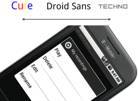
We've complained (maybe carped is a better word) about the lack of design unity in Android, but the truth is, there is one design element that's consistent across the entire OS: the Droid font, the result of an intense, two-year collaboration between digital typeface company Ascender and Google. Throughout the design process, it swung from bubbly, candy-coated Google cuteness to a harsher, blocky techno style before something more neutral and approachable was settled on—Droid. It's the only font on the phone—apps will use it too, since it's in the SDK—with three variants: serif, sans serif and monospace. So it's a good thing they took their time. Unfortunately don't expect the usual Google easter eggs, since it was thought they would annoy developers, though I would've liked to see that Android icon. Typography geeks, what's your take?
[ Via: Gizmodo, The Gadget Blog ]
[ Tag: ]
No comments:
Post a Comment